KITTEN RUN
A paws-itively adorable casual adventure game.
THE
PITCH
Kitten Run is a casual mobile game that provides engaging, stress-free entertainment for young gamers and cat lovers.
It solves the problem of overly complex game mechanics by utilizing a simplified 'tap-to-play' interface and a clear visual map for progression. My role was to design the UI/UX, ensuring the interface was intuitive, the aesthetic was cohesive, and the gamification elements (currency, lives, map) were clear.


DESIGN
PROCESS
Discovery & Research
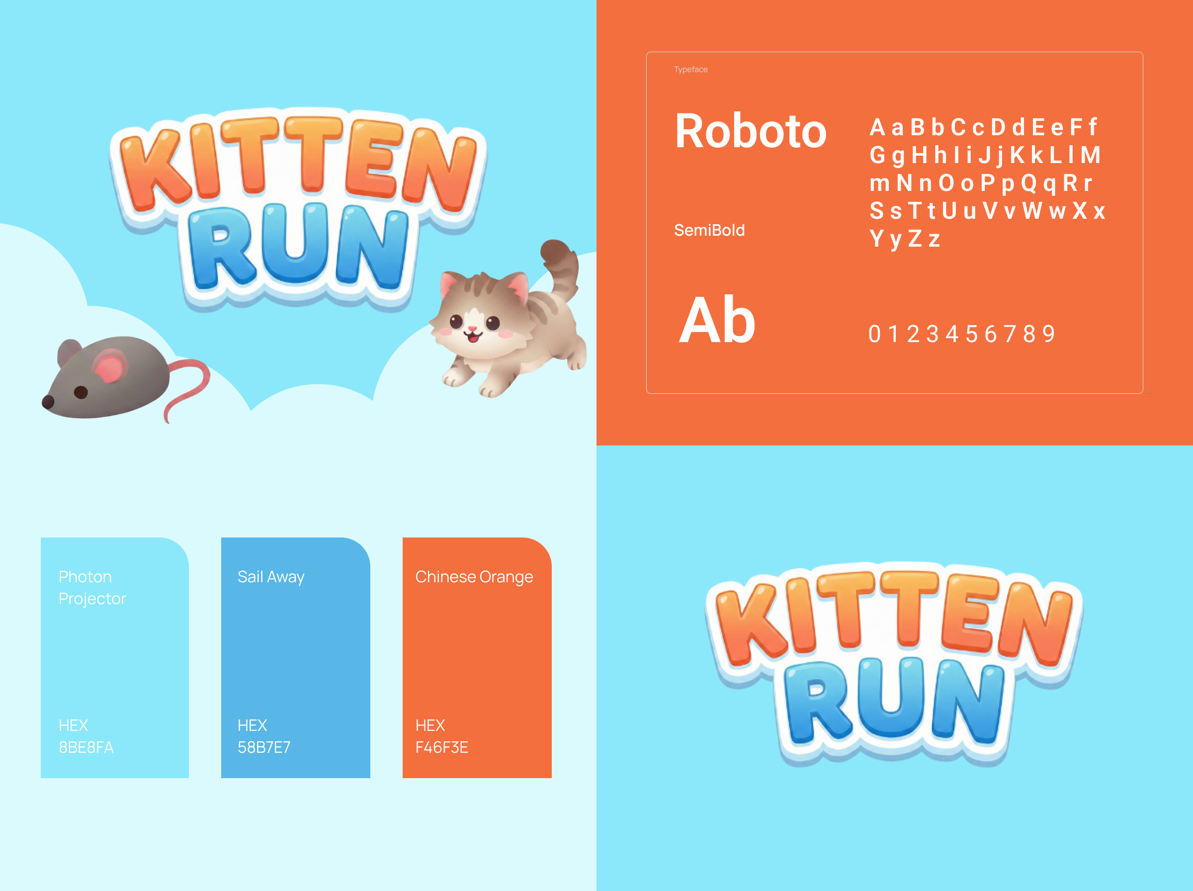
Because the casual game market is crowded, I analyzed the UI of top-performing match-3 and runner games in order to establish a familiar yet distinct visual language using bright, rounded aesthetics.
Navigation & Map
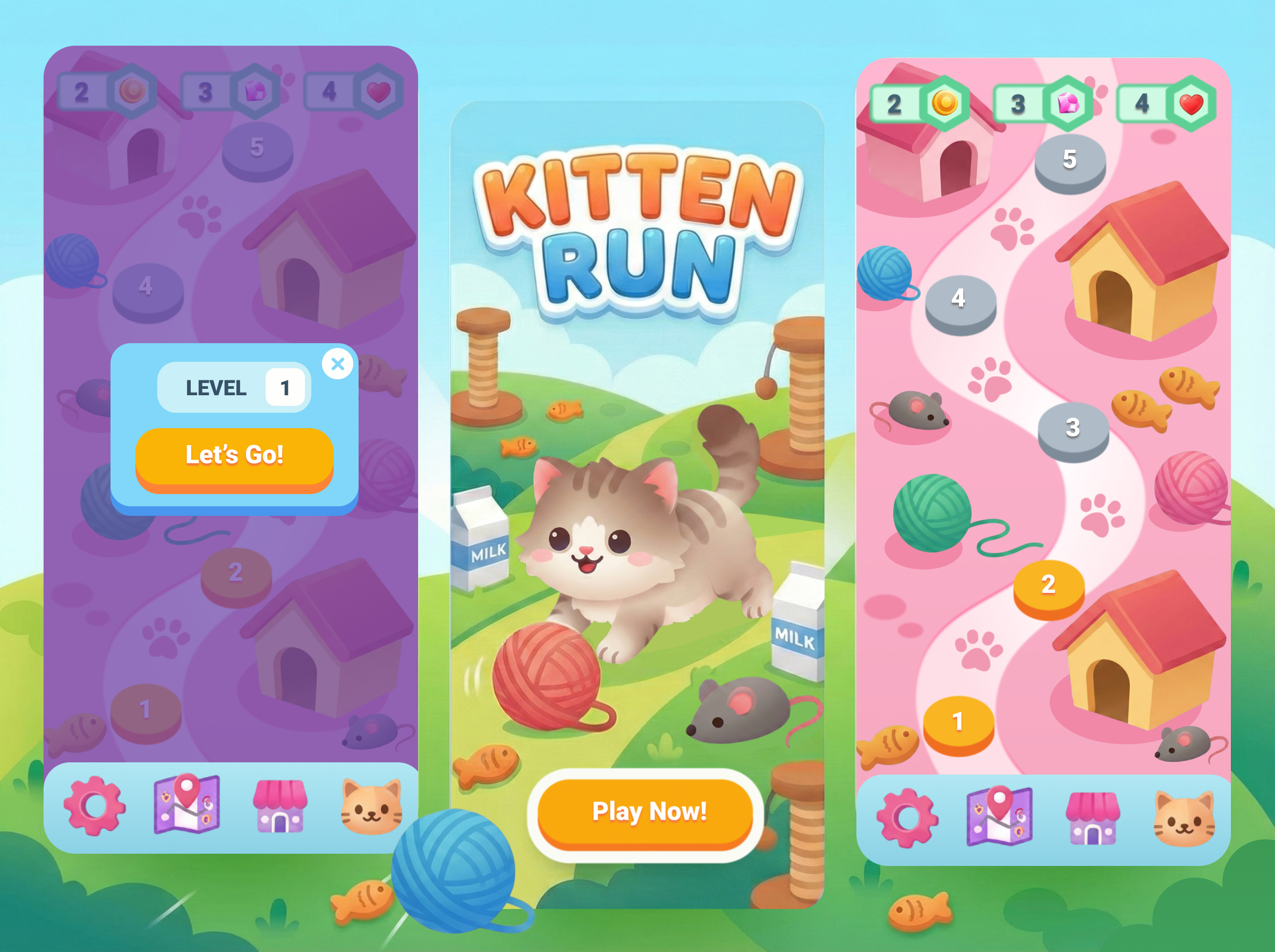
I designed a linear, winding path map with clear locked/unlocked states in order to give players a visual sense of accomplishment and clear future goals. The distinct paw-print trail helps guide the user's eye naturally up the screen. I used Nano Banana Pro to generate some of the illustrations and the landing page background.
Game Economy UI
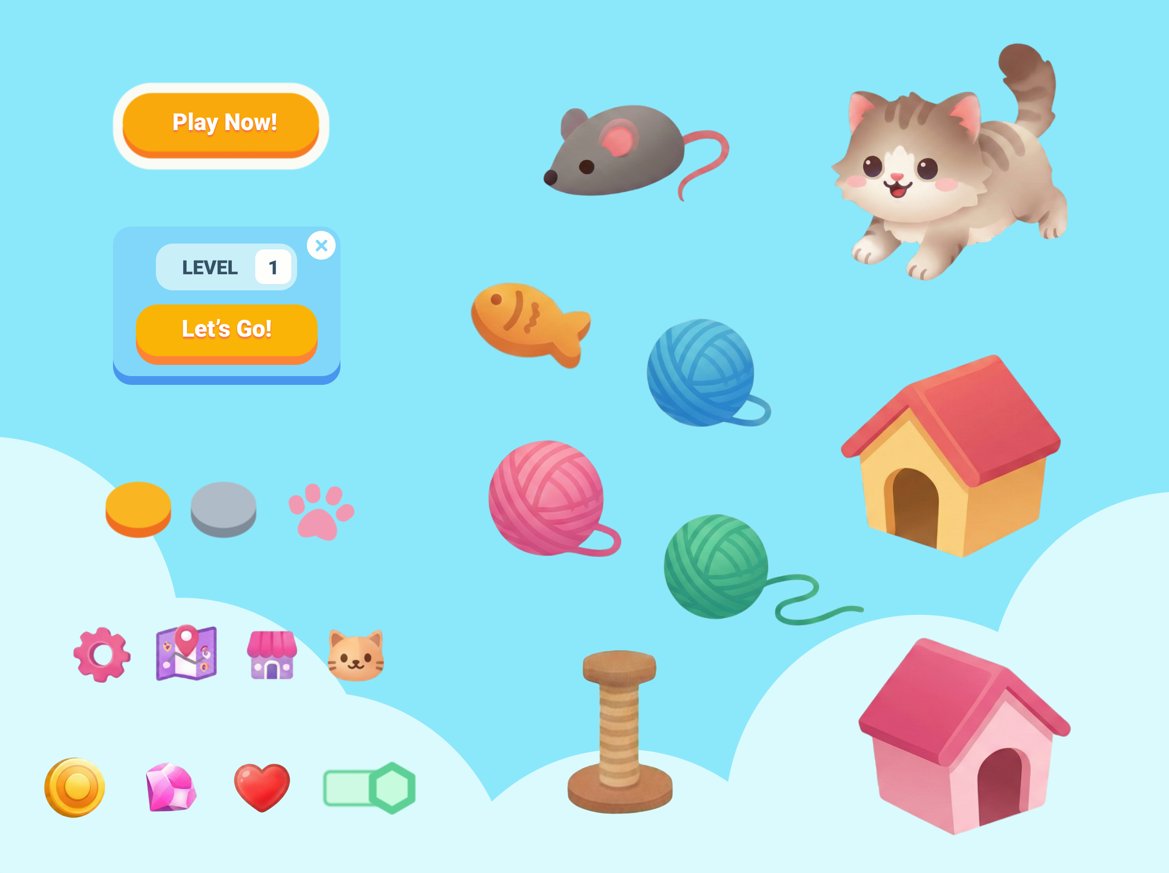
I created a unified top-bar HUD (Heads Up Display) containing Yarn, Coins, Gems, and Hearts in order to ensure players could track all their resources at a glance without cluttering the main play area.
Onboarding/Popups
I designed the 'Level 1' modal with a prominent 'Let's Go!' CTA in order to reduce friction between opening the game and starting gameplay, focusing on large touch targets for accessibility.


LEARNINGS
💡 What did I learn?
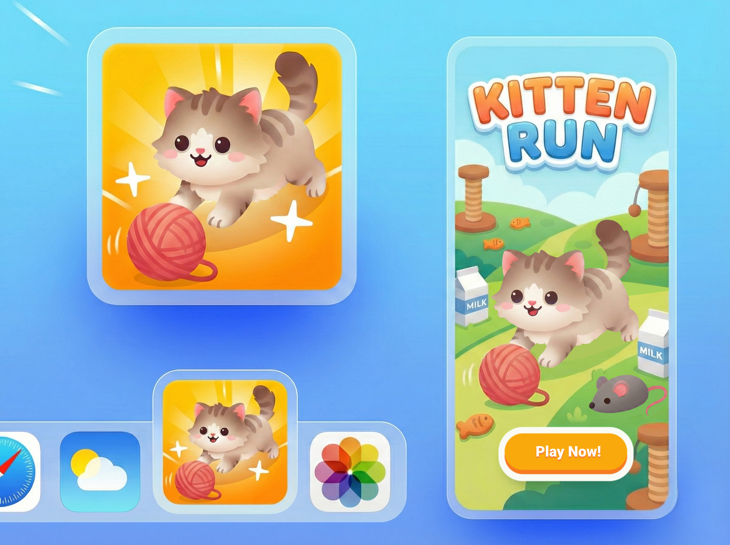
I learned the importance of visual hierarchy in mobile gaming. The "Play Now" and "Let's Go!" buttons needed to be the most dominant elements on the screen (using bright orange against green/blue backgrounds) to ensure the primary user flow was unmistakable.
😲 Surprising Insights
I realized that users often get overwhelmed by too many currencies. To address this, I grouped the resource counters (Yarn, Gold, Gems, Hearts) into a consistent top bar across all screens (except the Splash screen), ensuring the user always knows their status without searching for it.
🚧 Biggest Challenge
The most challenging aspect was balancing the "Cute" aesthetic with functional clarity. It is easy for a game to look cluttered with too many decorative elements (mice, milk, fish).