CLINIKA
A cloud-based SaaS for managing medical clinics.
THE
PITCH
Clinika is a clinic management panel that centralizes patient management, appointment scheduling, and content management for doctors and clinic assistants.
It solves the screen fatigue and data clutter experienced by healthcare professionals by offering a modern interface that is legible (using the Manrope font family) and prioritizes eye health (with Dark/Light mode support).
As of now, Clinika is still in development and is not available for public use.
BRAND
IDENTITY
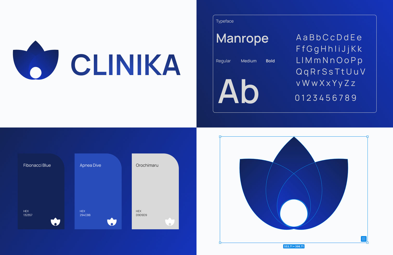
I selected blue tones like "Fibonacci Blue" and "Apnea Dive" to represent trust and technology, and chose the highly readable "Manrope" typeface for the brand identity.
The "lotus/flower" form in the logo combines with the feel of a modern technology company, with curves echoing throughout the UI components.
UI & UX
DESIGN
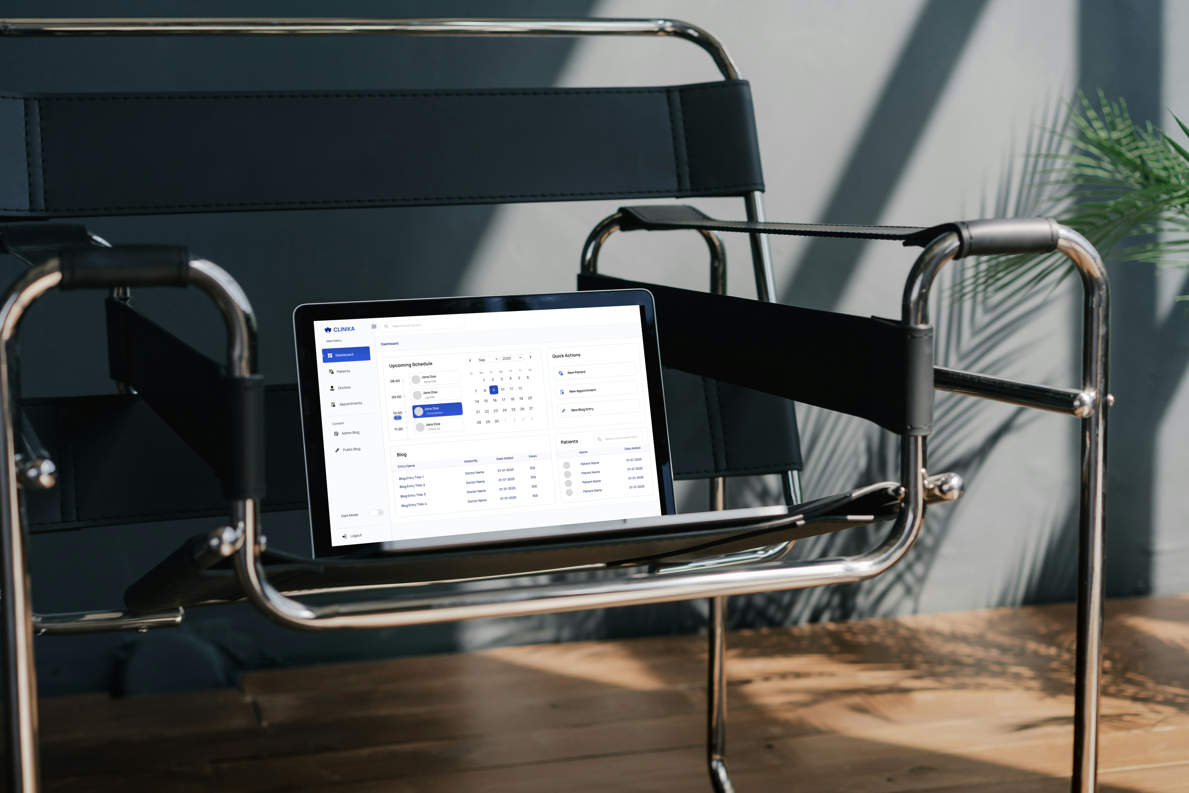
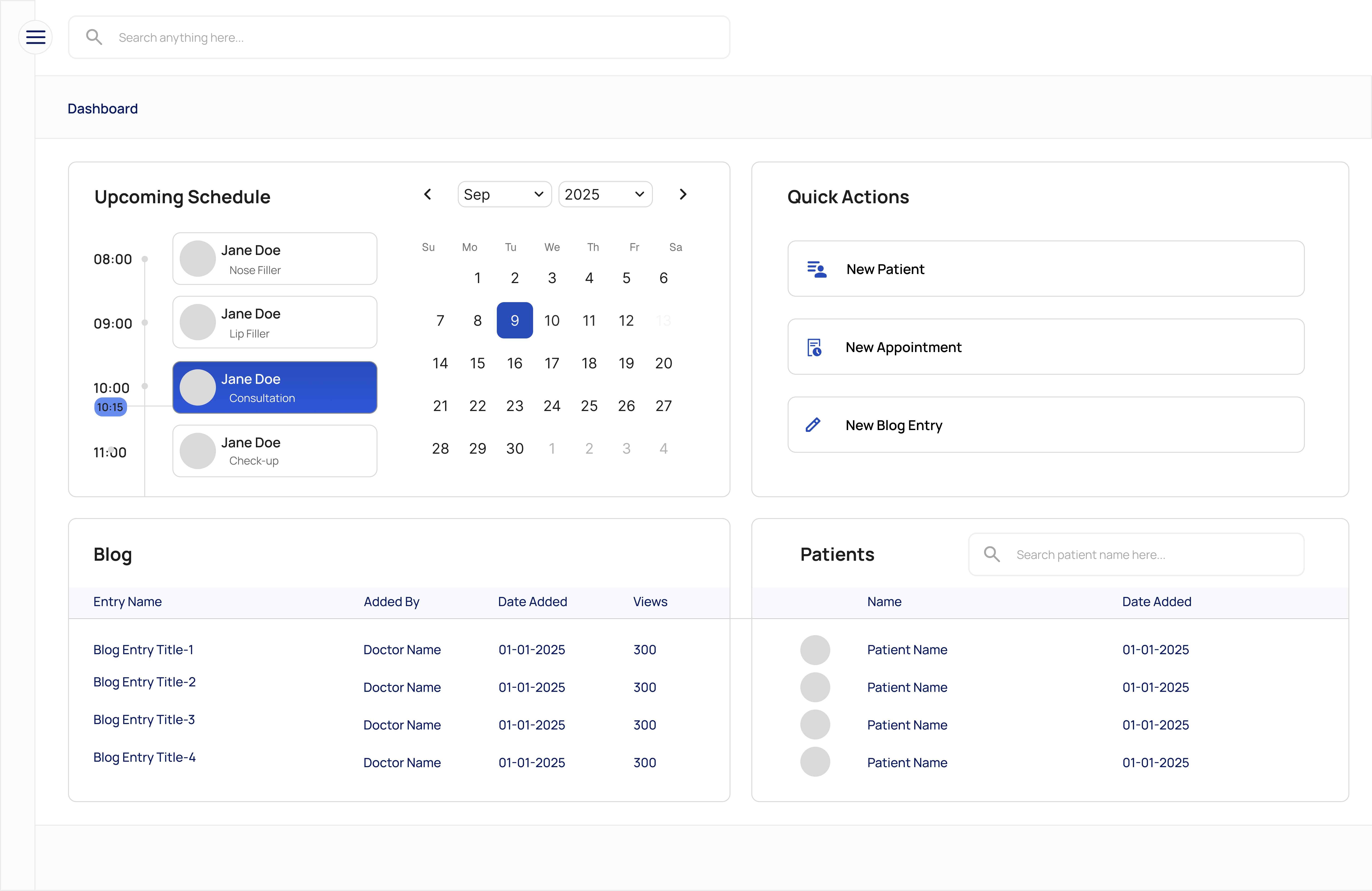
I prioritized the "Upcoming Schedule," "Quick Actions," and "Patients" modules in a card-based structure. This allows users to perform 80% of their daily workflow with a single click.
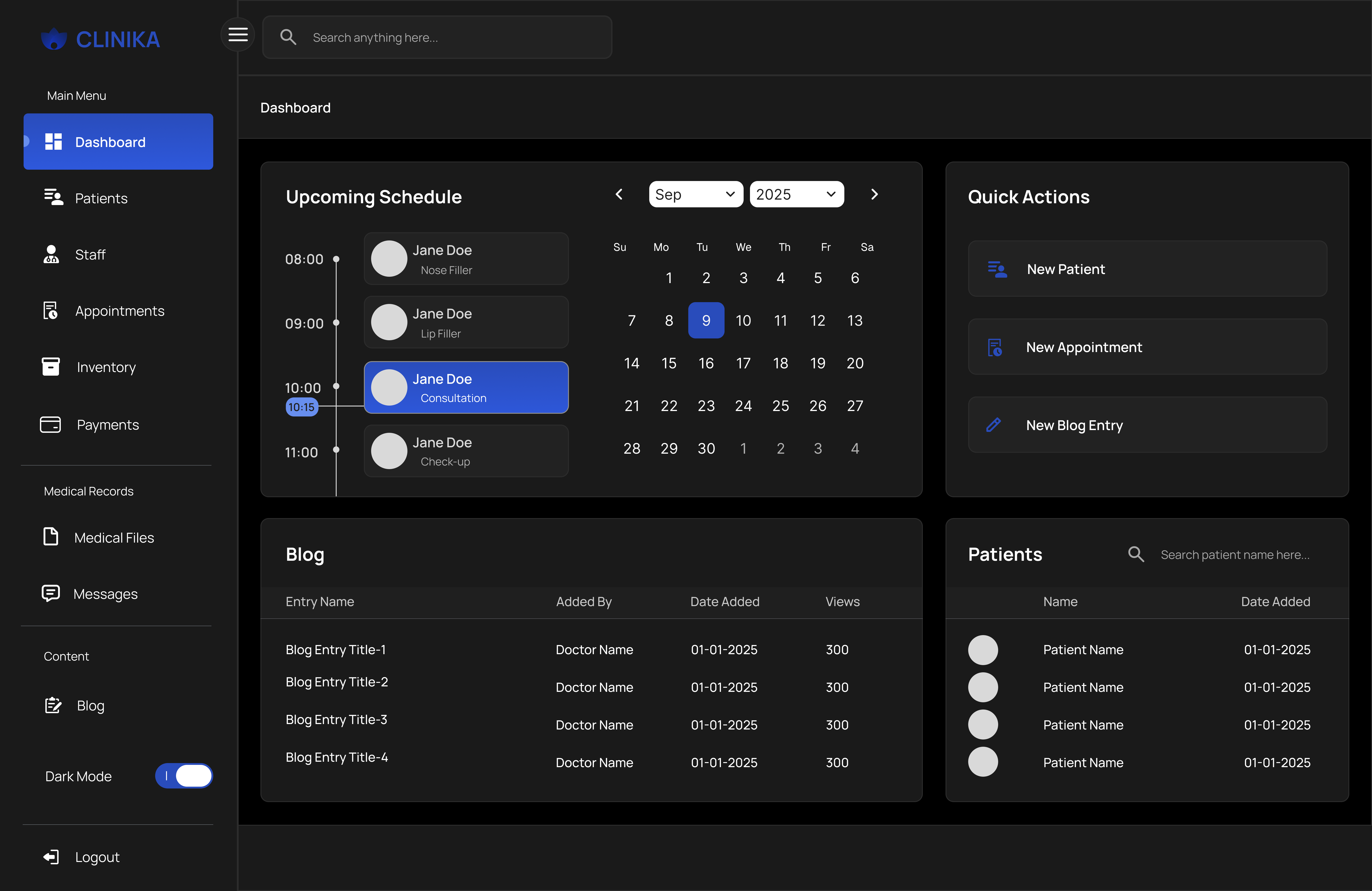
A major focus was the "Dark Mode" design. Instead of pure white text on black, I used eye-friendly gray tones and soft blue accents to minimize eye strain for night shifts.
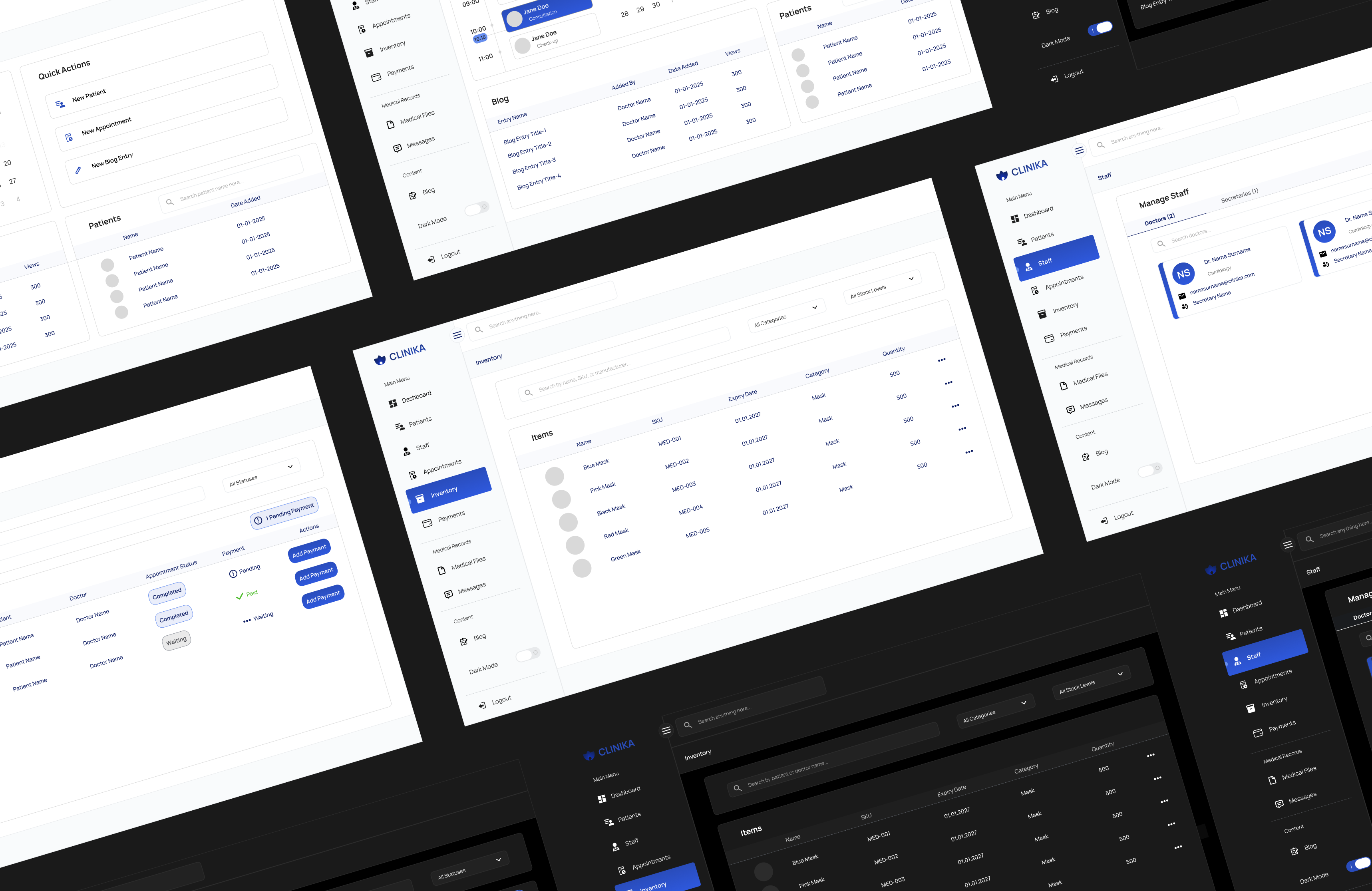
Responsive Layouts
Project Overview
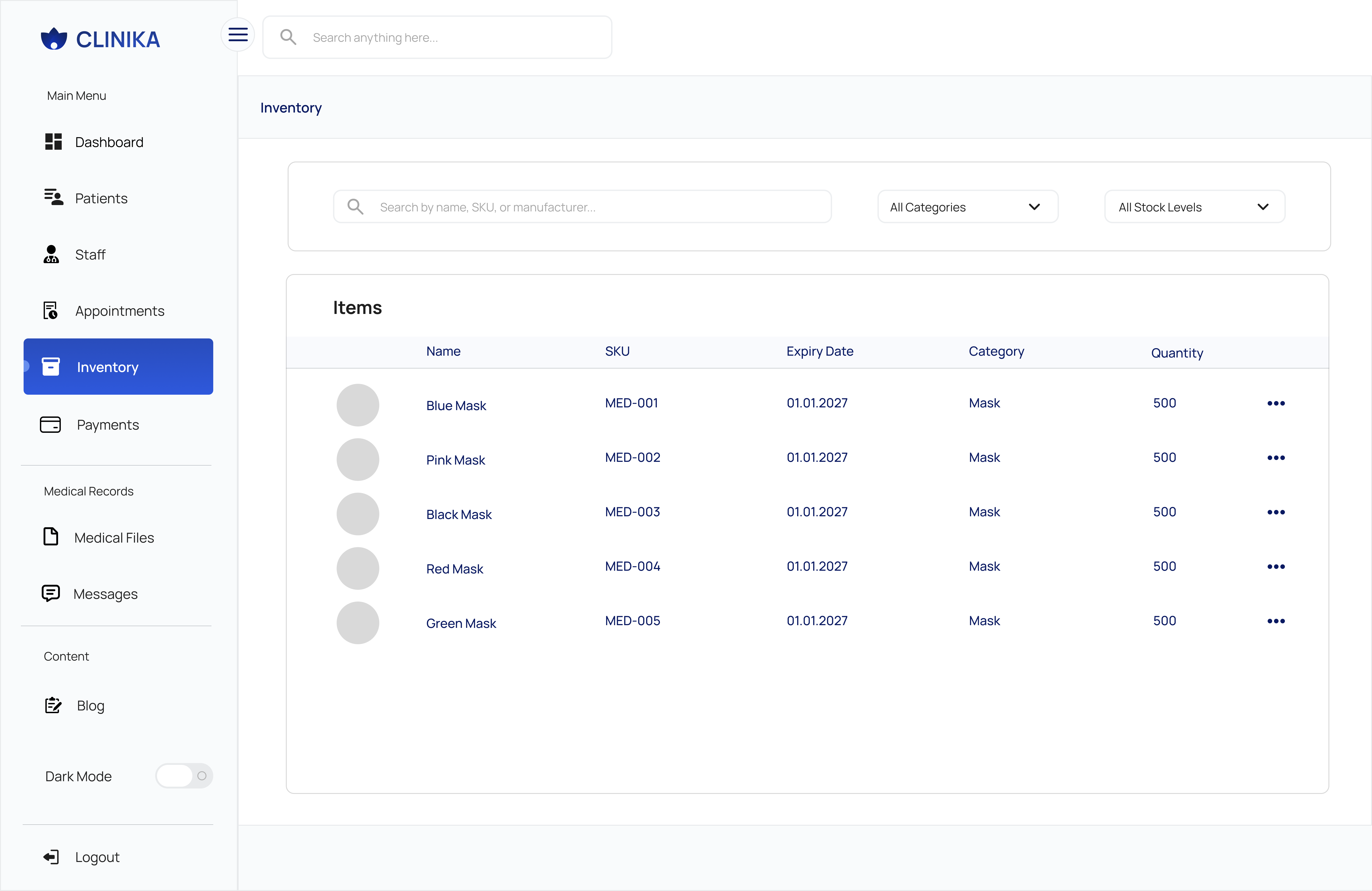
Inventory Management
Light Mode
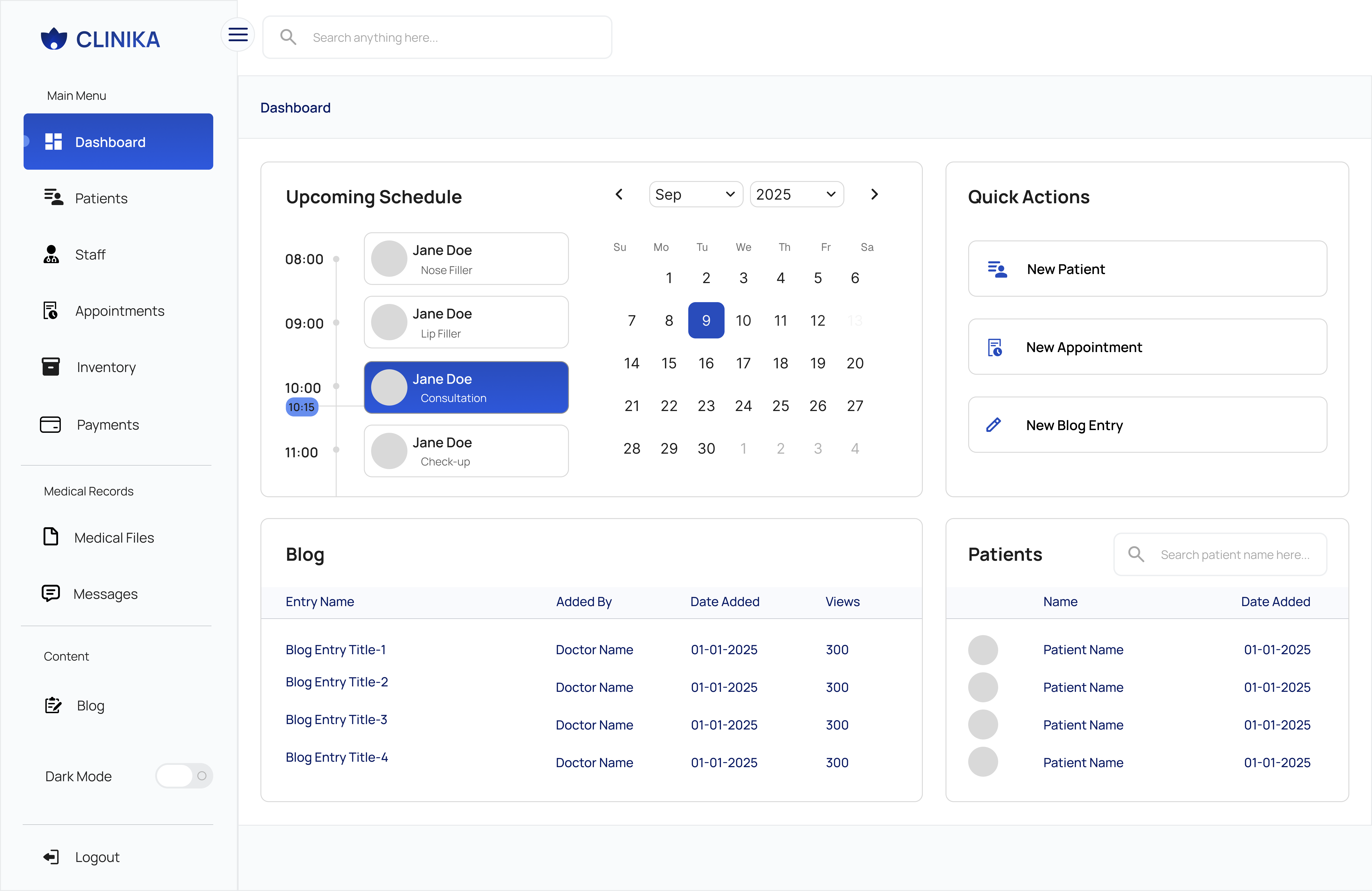
Dashboard
Light Mode
Dashboard
Dark Mode
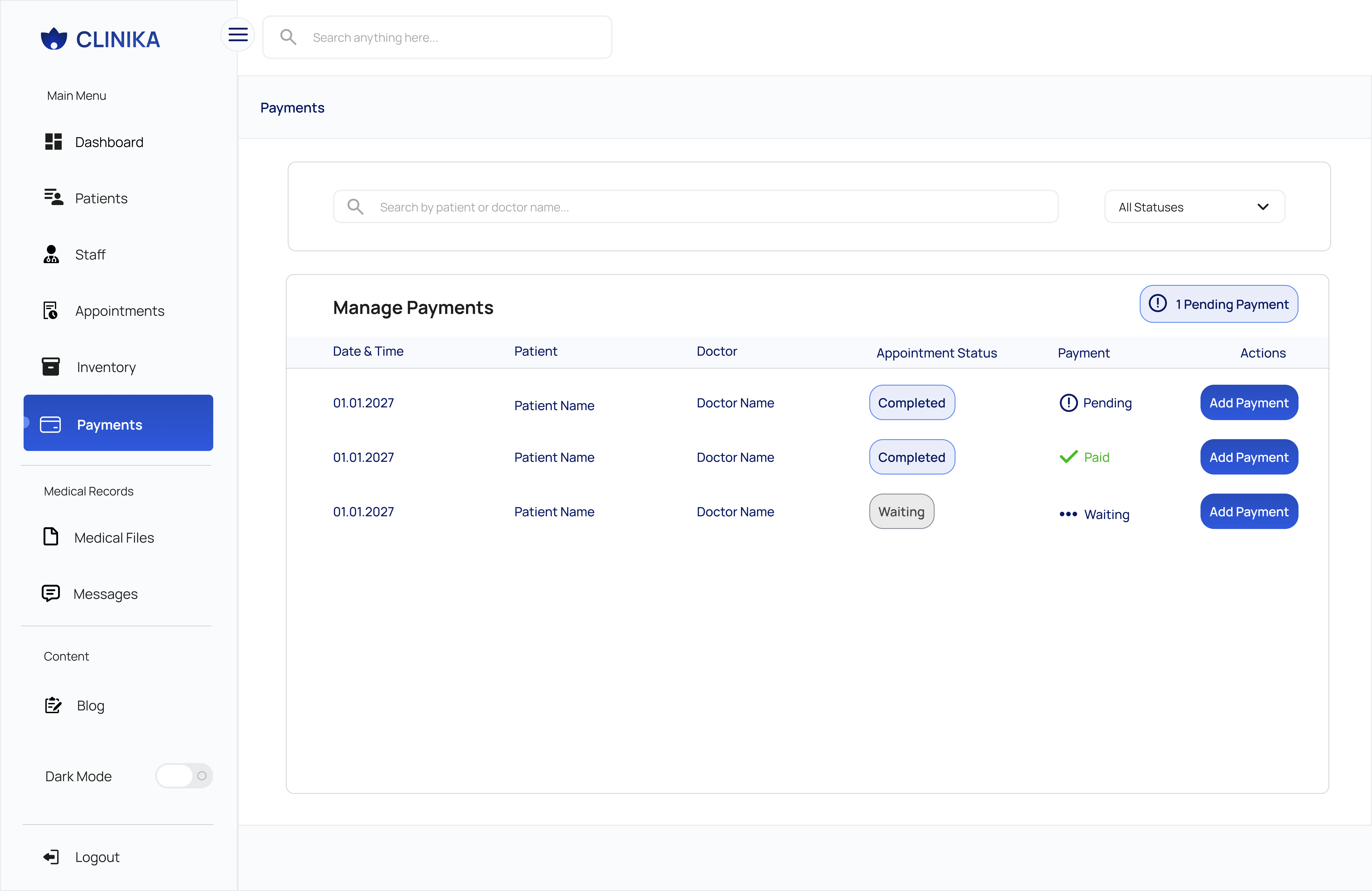
Payments
Financial Management
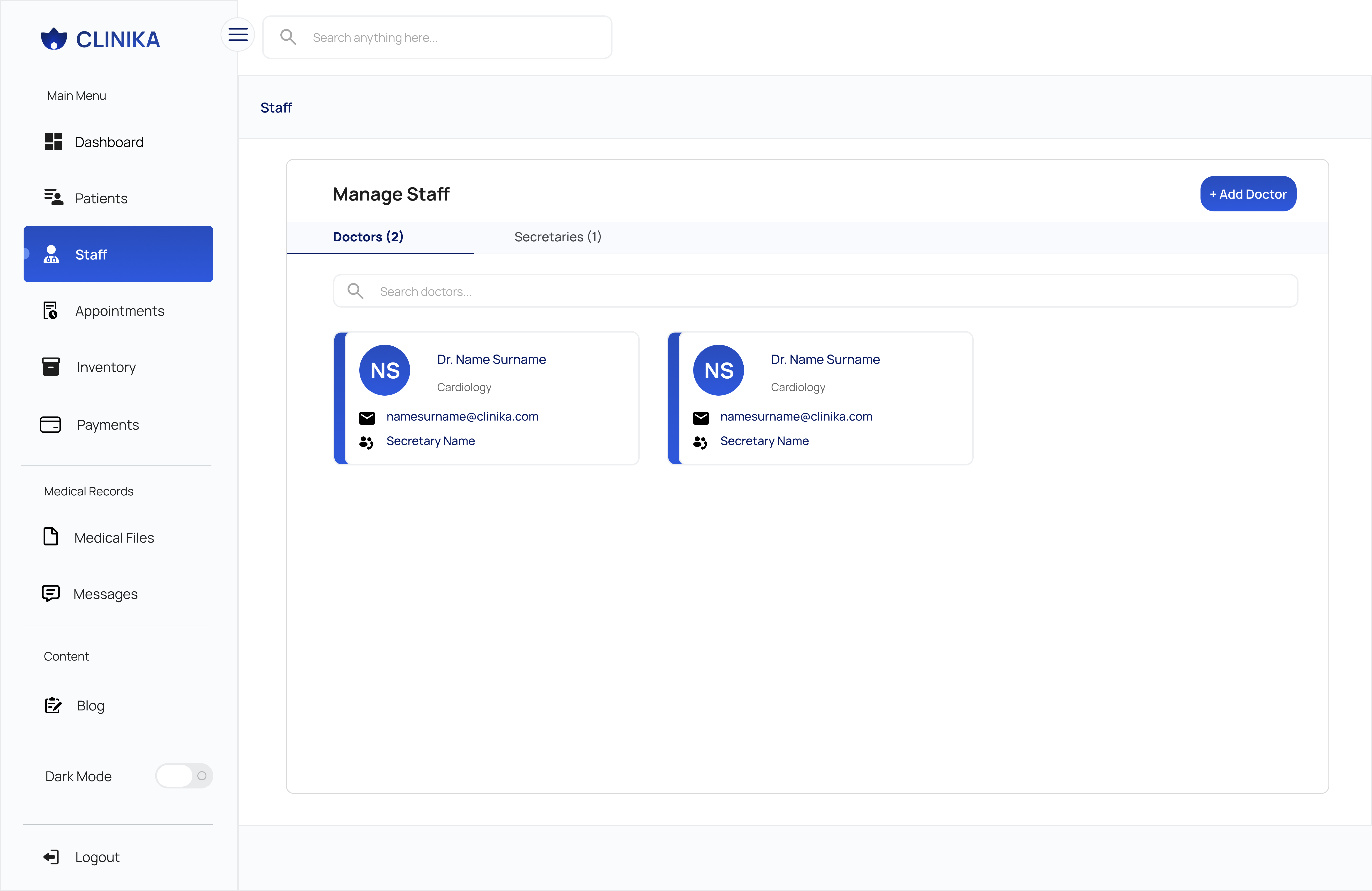
Staff Management
HR & Permissions
Dashboard
Light Mode Variation
Wireframes
Layout Structure
LEARNINGS
💡 What did I learn?
In this project, I learned how data-dense dashboards can be both functional and aesthetic.
🚧 What was the biggest challenge?
The most significant challenge was designing information-heavy screens that remain intuitive for users. Since the dashboard displays dense data—such as hourly schedules, patient lists, and blog logs—I needed to ensure the interface didn't feel cluttered. I overcame this by utilizing a clean, card-based layout, resulting in a modular design that is both easy for users to understand and efficient for developers to implement.
✨ My Favorite Part
My favorite part of the project was combining the "lotus/flower" form in the brand logo with the feel of a modern technology company and carrying the curves of this form to the rounded corners (border-radius) of the buttons and cards in the dashboard. This ensured a consistent visual language throughout the design.